EC justifies need for new logo
 The Electoral Commission (EC) has justified its decision to replace its old logo with a new one.
Mrs Charlotte Osei, the EC Chairman, said the logo denoted a unified purpose and vision, and ultimately demonstrated the Commission’s independence.
The media, early this month broke the news that the EC intends to replaces its existing logo which consists of the coat of arms and a ballot box with a new logo and this drew a huge backlash from political parties and a cross section of the public who quizzed the need for the replacement.
Mrs Osei said at the launch of the Commission’s five-year Strategic Plan and new website, that the use of the coat of arms in the old logo denoted the authority of the central government.
She said the use of the ballot box in the old logo was also not suitable enough as the Commission’s mandate went beyond the ballot box; adding that the EC had regulatory oversight functions over political parties.
She said the Commission was happy with the choice of its new logo as it reminded it of the values that it wanted to bring into its work and where it was going as an entity.
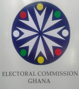
The Chairman explained that the Circle of the new logo represents unity; singular and unified in its purpose for “our democracy”.
“The Blue of the Circle represents the Stability and Independence of the Commission, while the inward moving arrows reflect all the people of Ghana equally coming together for the common purpose – the right to select their political leadership,” she said.
“The use of the red, gold and green represents our country Ghana, whereas the whole identity represents a unified common purpose and vision and demonstrates our independence as an institution,” she added.
Source: GNA
