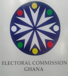
EC to explain new logo before April ending
 Mr Samuel Boadu, Acting Director, Human Resource at the Electoral Commission (EC) at the weekend assured Ghanaians that the Commission would offer explanation on the essence of its new logo before the end of April.
Mr Boadu who made this known at a day’s capacity-building workshop for media practitioners in Takoradi said the Commission would come out with the reasons for the new logo so that Ghanaians and stakeholders would appreciate its importance.
The workshop was on the theme: “Enhancing Inclusiveness in Ghana’s Electoral Process.”
The event, which was organised by the EC and funded by the United States Agency for International Development, educated media practitioners on election reportage and explained some salient issues in the Constitutional Instrument (L.I 91), which would govern this year’s elections.
The EC unveiled the new logo, which has been heavily criticised by a section of the public and generated a lot of debate.
The new EC’s logo comprised eight arrow shapes all pointing to the middle with eight red, green, yellow and whites dots at the bottom, which have been placed on a navy blue background while the Electoral Commission of Ghana has been inscribed in capital letters below.
The old logo of the Commission had a crest flanked by two eagles with a black star in the body of the crest. The circumference had the inscription of Ghana Electoral Commission while the middle comprised a symbol of a box and a suspended hand dropping a ballot into it.
Some Ghanaians believe that the new logo is telling the work of the Commission upon a quick glance but the old one was much clearer with its functions and, therefore, must be maintained.
Source: GNA
